User Interface
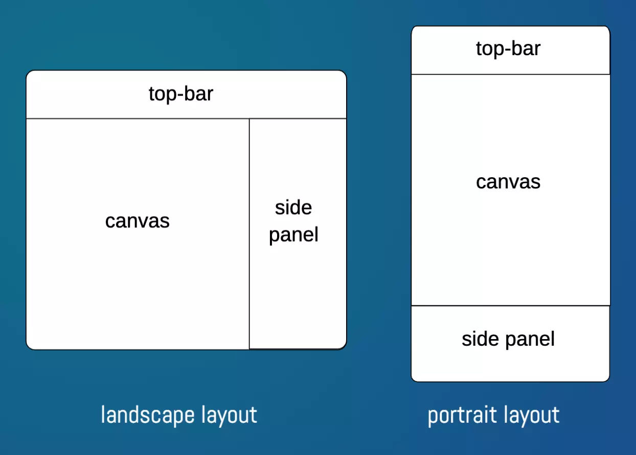
The design window in PhotoFairy consists of three primary components: the canvas, the top bar, and the side panel. The "canvas" serves as the central area where you can add, modify, and compose various graphic objects. The "top bar" provides a set of tools for adding new graphic elements to your canvas, and frequently used buttons including undo/redo, title, layers toggle, and helpbuttons. The "side panel" displays context-specific actions for selected object(s) and also houses the layers list, allowing you to manage and organize your design elements effectively. The arrangement of these three components varies slightly between landscape and portrait layouts, as illustrated below.
The canvas region is composed a canvas and a toolbar under the canvas, which provides some common controls for canvas navigation and interaction setting, and design frame adjustment. More button annotations, including the canvas navigation buttons on the bottom of canvas, are shown below.
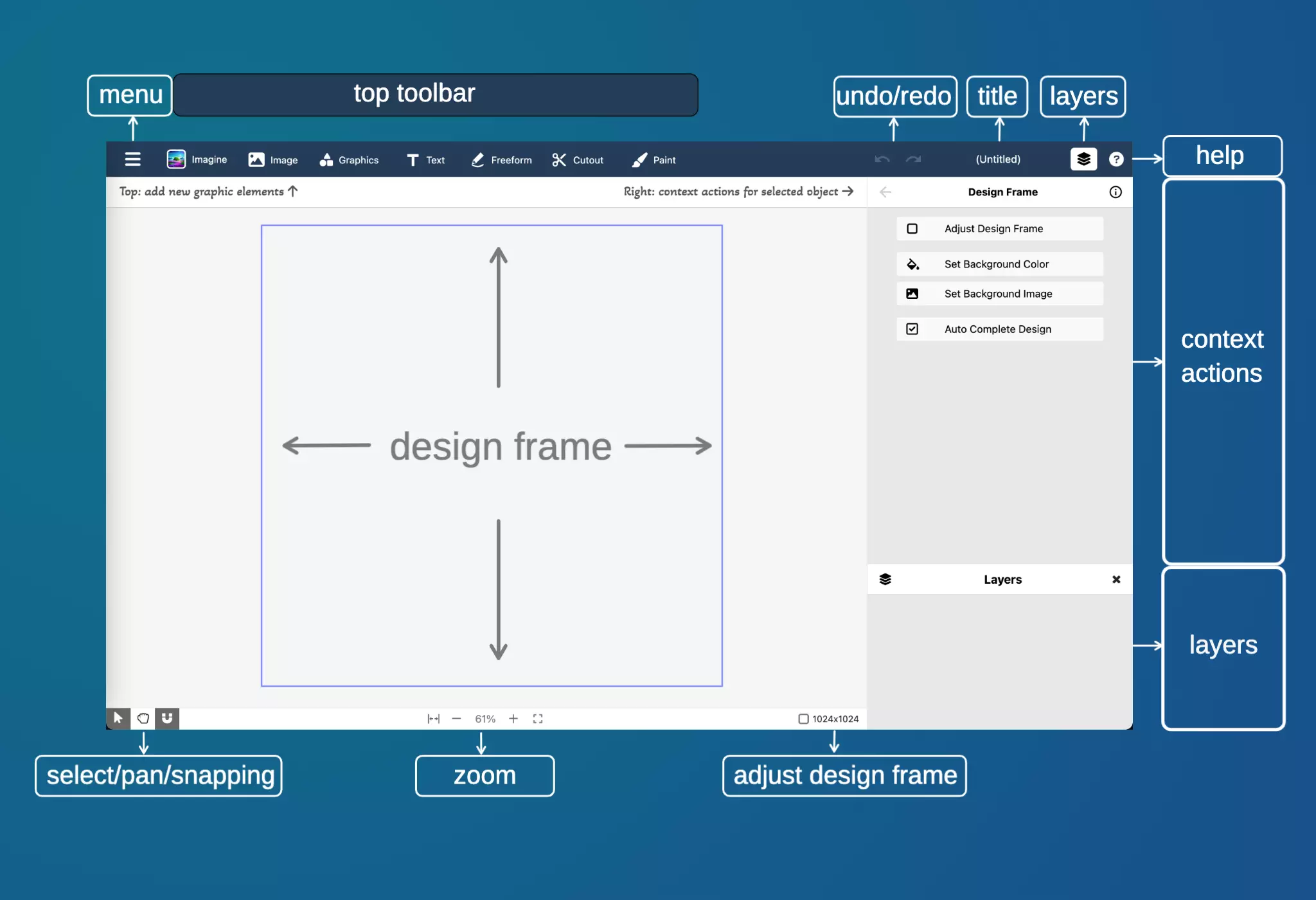
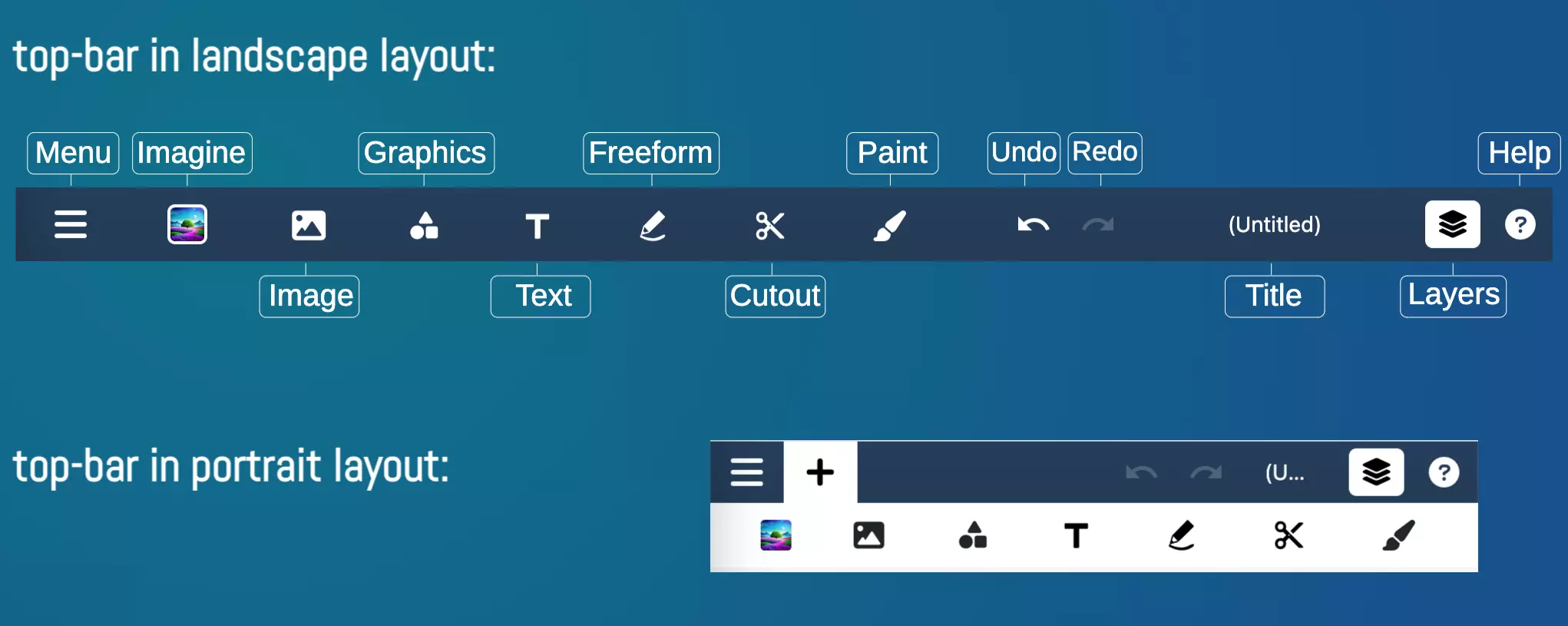
The buttons on the "top bar" is annotated and shown below.
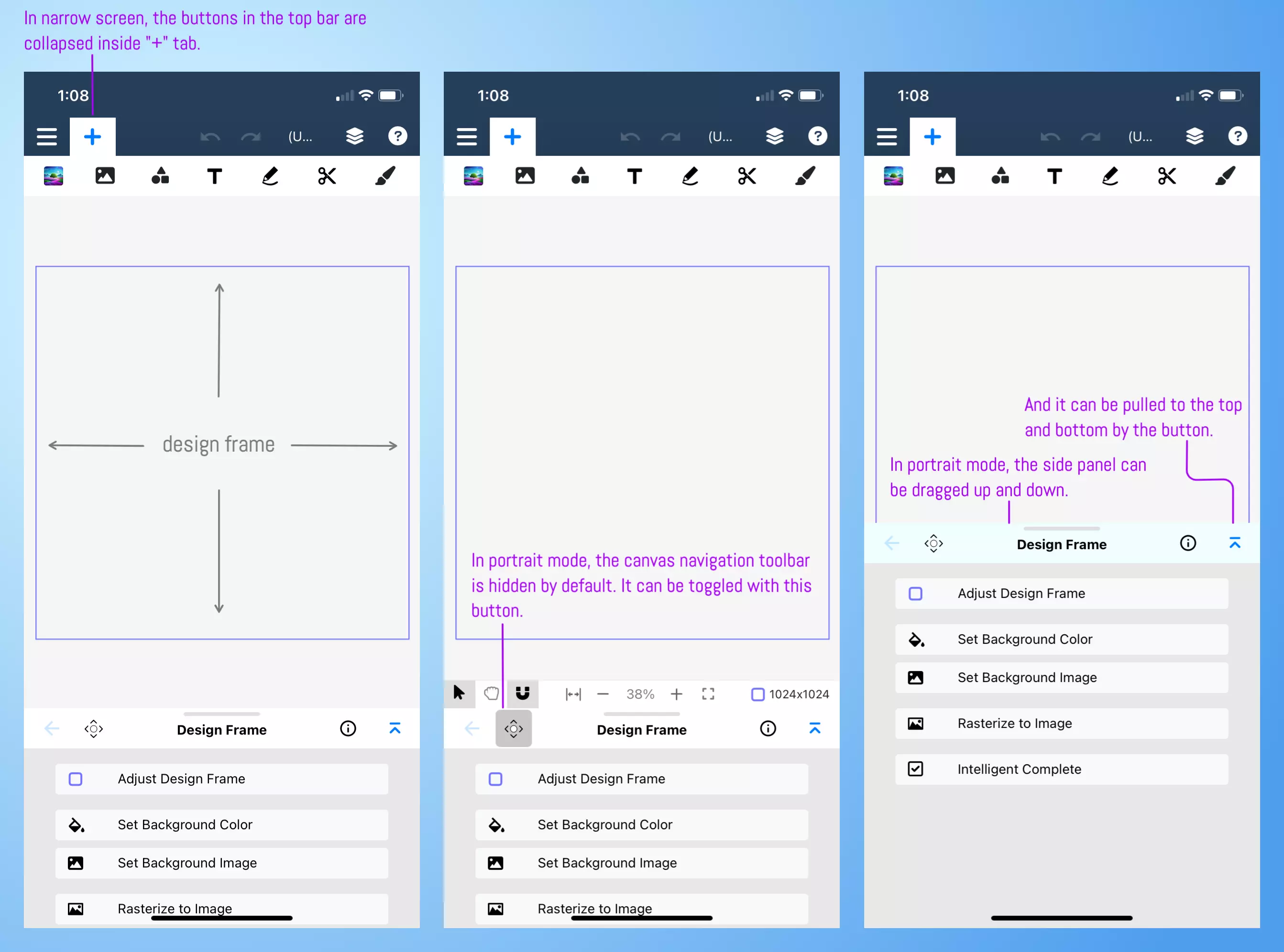
The user interface is more compact in portrait mode. The annotated figure below highlights several important distinctions compared to the landscape mode.
 |
 |
 |